WD: Beautiful Website 2.0
Friday, January 18, 2013 | 3:04 AM | 0 hearts♥

http://williamleeks.com/index.php
Good
- cute graphic that can attract people to explore more in this website.
- linking words will be highlighted to let people know that's a click through link.
- neat arrangement of grid makes the content easy to be read.
Bad
- more details can be added into content.
- more graphic can be apply into design.
- navigation bar not obvious, not enough of hierarchy.
- no sitemap at the below part of website.
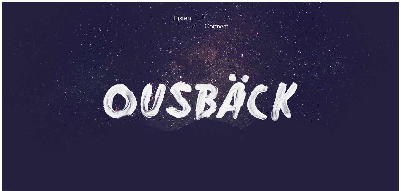
http://www.iamousback.com/
Good
- nice background.
- simple arrangement and simplified content.
- special navigation, typo arrangement are special compare with the normal navigation bar.
Bad
- more colour can be applied
- navigation bar nice but not obvious.
- lack of content and informations.
- no sitemap at the below part of website.

http://www.teamgeek.co.za/#work
Good
- cute animation that the error will follow the page that you go at the navigation bar.
- cute navigation design.
- neat arrangement of every pages of website.
- nice use of typography to show hierarchy.
Bad
- more colours can be added to the design.
- navigation roll over effect can be nicer.
- sitemap is needed or labels for navigation bar.

http://itsashapechristmas.co.uk/
Good
- nice colour mood.
- neat website that use only one typeface.
- creating way that used calendar to present the website.
Bad
- less information
- confusing navigation, not outstanding and people will not know where to click.
- no title or logo.
- hierarchy are needed.
- sitemap is needed or labels for navigation bar.