WD2 : Beautiful Website 3.0
Sunday, January 27, 2013 | 11:57 PM | 0 hearts♥
http://lamoulade.com
Good:
- Simple colour mood, wont be so complicated.
- Creative effect of scrolling, move as animation.
- Nice and special grid system, in slanted way.
Bad:
- Navigation bar are needed.
- Confusing design, don't know where to click or not click.
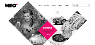
http://neolab.no/
Good:
- Simple colour, not confusing.
- Creative way to show out the artwork and portfolio.
- Very nice navigation, orinally B&W once mouse over it will turn into colours.
- Right use of typefaces, nice logo design and neat bodytext.
Bad:
- Nice showing of portfolio but make people confuse easily.
http://www.lindadong.com
Good:
- Plain and simple colour.
- The blog posts are all aligned to center.
- All the contents are neatly arrange.
Bad:
- Navigation bar not obvious.
- Maybe can be more playful.
- More colours can be applied.
http://builtbybuffalo.com/
Good:
- Creative way to design the blog, "infographic" feel.
- Nice combination of colour.
- Navigation bar are clear enough.
- Clear typeface, easy to read.
Bad:
- Maybe a little too boring.
- Navigation bar can be more "playful" or interesting, more obvious.


