WD2 : Beautiful Website 3.0
Sunday, January 27, 2013 | 11:57 PM | 0 hearts♥

http://lamoulade.com
Good:
- Simple colour mood, wont be so complicated.
- Creative effect of scrolling, move as animation.
- Nice and special grid system, in slanted way.
Bad:
- Navigation bar are needed.
- Confusing design, don't know where to click or not click.

http://neolab.no/
Good:
- Simple colour, not confusing.
- Creative way to show out the artwork and portfolio.
- Very nice navigation, orinally B&W once mouse over it will turn into colours.
- Right use of typefaces, nice logo design and neat bodytext.
Bad:
- Nice showing of portfolio but make people confuse easily.

http://www.lindadong.com
Good:
- Plain and simple colour.
- The blog posts are all aligned to center.
- All the contents are neatly arrange.
Bad:
- Navigation bar not obvious.
- Maybe can be more playful.
- More colours can be applied.

http://builtbybuffalo.com/
Good:
- Creative way to design the blog, "infographic" feel.
- Nice combination of colour.
- Navigation bar are clear enough.
- Clear typeface, easy to read.
Bad:
- Maybe a little too boring.
- Navigation bar can be more "playful" or interesting, more obvious.
WD: Beautiful Website 2.0
Friday, January 18, 2013 | 3:04 AM | 0 hearts♥

http://williamleeks.com/index.php
Good
- cute graphic that can attract people to explore more in this website.
- linking words will be highlighted to let people know that's a click through link.
- neat arrangement of grid makes the content easy to be read.
Bad
- more details can be added into content.
- more graphic can be apply into design.
- navigation bar not obvious, not enough of hierarchy.
- no sitemap at the below part of website.
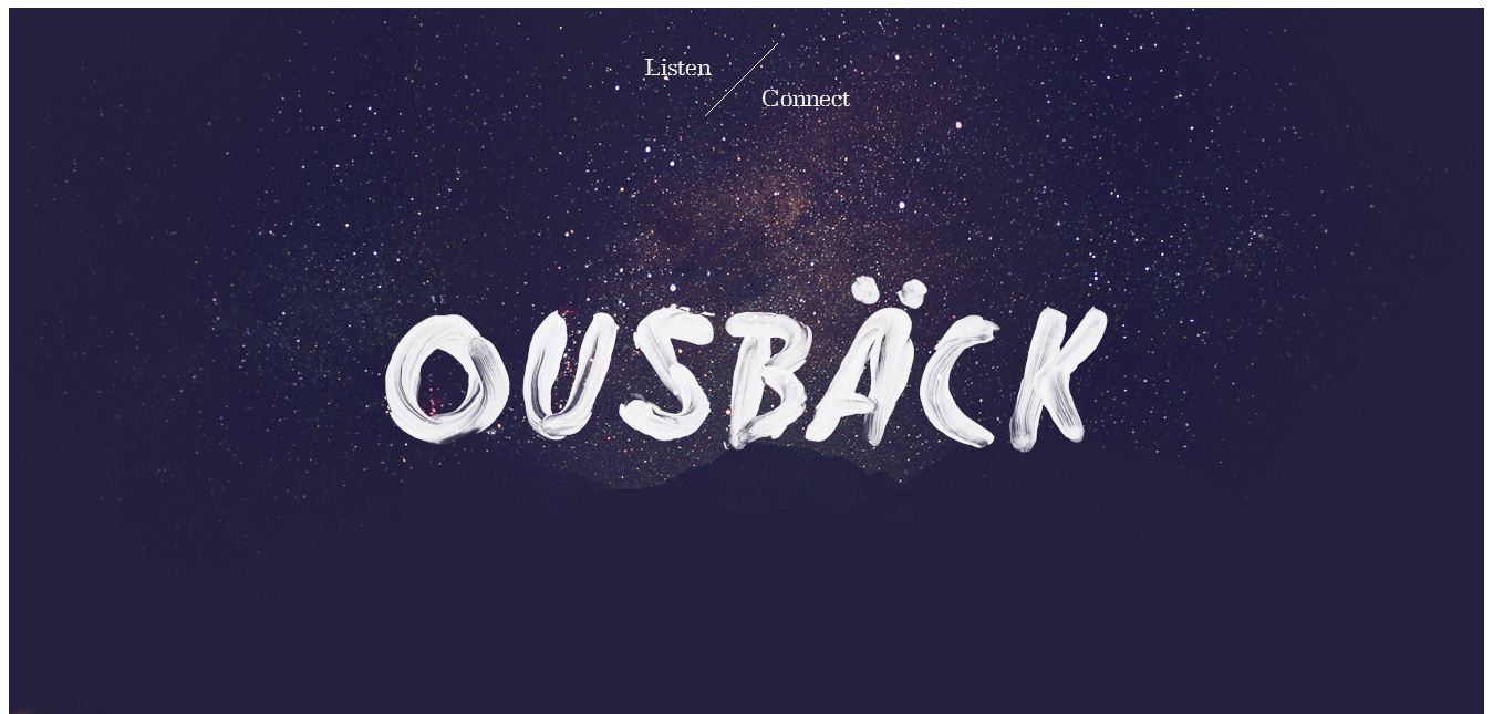
http://www.iamousback.com/
Good
- nice background.
- simple arrangement and simplified content.
- special navigation, typo arrangement are special compare with the normal navigation bar.
Bad
- more colour can be applied
- navigation bar nice but not obvious.
- lack of content and informations.
- no sitemap at the below part of website.

http://www.teamgeek.co.za/#work
Good
- cute animation that the error will follow the page that you go at the navigation bar.
- cute navigation design.
- neat arrangement of every pages of website.
- nice use of typography to show hierarchy.
Bad
- more colours can be added to the design.
- navigation roll over effect can be nicer.
- sitemap is needed or labels for navigation bar.

http://itsashapechristmas.co.uk/
Good
- nice colour mood.
- neat website that use only one typeface.
- creating way that used calendar to present the website.
Bad
- less information
- confusing navigation, not outstanding and people will not know where to click.
- no title or logo.
- hierarchy are needed.
- sitemap is needed or labels for navigation bar.
Sitemap, Gantt Chart, Moodboard
Sunday, January 13, 2013 | 4:51 AM | 0 hearts♥

Sitemap

Gantt Chart

Moodboard
Gurney: Research of competitors
Saturday, January 12, 2013 | 4:56 AM | 0 hearts♥

http://www.vivocity.com.sg
- typeface: Arial
- interesting design that show out the shopping mall photos.
- navigation bar are place at right place, but the font can be bigger so that it can be more obvious.
- simple arrangement, everything can be easily found.
- every content is "simplified" and clearly stated.
- overall website font can be bigger.

http://www.marinasquare.com.sg
- typeface: Open Sans, can be read easily.
- purple colour mood created the grand feel.
- more hierarchy can be create for the title and body text.
- overall colour mood are nice, look unit together.
- neat arrangement, but can be "loosen", everything looks like squeezing together.

http://www.orchardcentral.com.sg
- typeface: Helvetica, one of the most common used typeface.
- dark background makes the text more outstanding.
- cute icon design for navigation bar.
- very cute rollover effect on navigation bar.
- arrangement can be enhance, too much things together.

http://www.pavilion-kl.com
- simple colour mood, use only red colour.
- typeface: Arial, a very clear and easy to be read typeface.
- different colour of roll over effect in navigation bar.
- neat arrangement of text and photos.
- maybe can wider the content, too much blank space left on the right and left side.
- is like squeezing all the content together.
WD2: Beautiful Website
| 4:05 AM | 0 hearts♥

http://www.caavadesign.com/
- very interesting graphic that can attract people easily.
- very nice colour mood that comfortable to view.
- scrolling down effect on linking to another page.
- simple colour mood that can create contrast and beautify the website.
- very nice typo arrangement, comfortable and easy to read.

http://www.malaikadesigns.com/stores/
- the website design perfectly match the theme and the style.
- neat and simple, no display type used, clear typography that can be easily read.
- navigation bar place in the right part that can be easily seen.
- colour matching is soft, white colour words can be seen too.

http://bluepixel.net/
- right placement of the title and navigation bar.
- very strong and "formal" website because of the colour mood.
- blue colour matches the title Blue Pixel
- typography used are clear enough to read
- black colour fonts are suitable and easy to read too.
- nice hierarchy as the title will bigger and body text smaller.
- typography arrangement are simple and clear, not much content putting separately.

http://analog.coop/
- simple, not much text and photos.
- neat, use only one typeface for the website.
- neat arrangement that the body text can be read easily.
- same alignment or the whole website.
- use only scrolling for the whole original website.
Beautiful Website 6.0
Sunday, October 14, 2012 | 5:21 PM | 0 hearts♥


- the overall website is clean and simple.
- the scrolling bar is special.
- the grid and word arrangement are tidy.
- typography is clear and hierarchy has shown too.


- use only typography for the website design.
- used suitable typography and shown hierarchy.
- simple yet professional.
- look interesting that makes people want to re-enter again.
- only two colours but never look boring.


- this website is more focus on using typography to design.
- very special design of website.
- it has special effect too when you proceed to another page after you clicked the navigation bar.
- future and techno feeling.


- this website is more focus on printing.
- the colour use for the website design is CMYK (Cyan Magenta Yellow Black)
- the design that when it changes from this page to another page is also special.
- a very beautiful logo design.
Design Agencies
Wednesday, October 10, 2012 | 8:15 PM | 0 hearts♥
Design Agencies (International)no-bo.co
deletelondon
project365
solidgiant
ducttapeandglitter
Design Agencies (Local)
ximnet
adveasia
creativecream
alpha245
optima
surfloft